Color Elements
These are some highly experimental color-related web components. Use at your own risk, the API can change at any point.
All elements
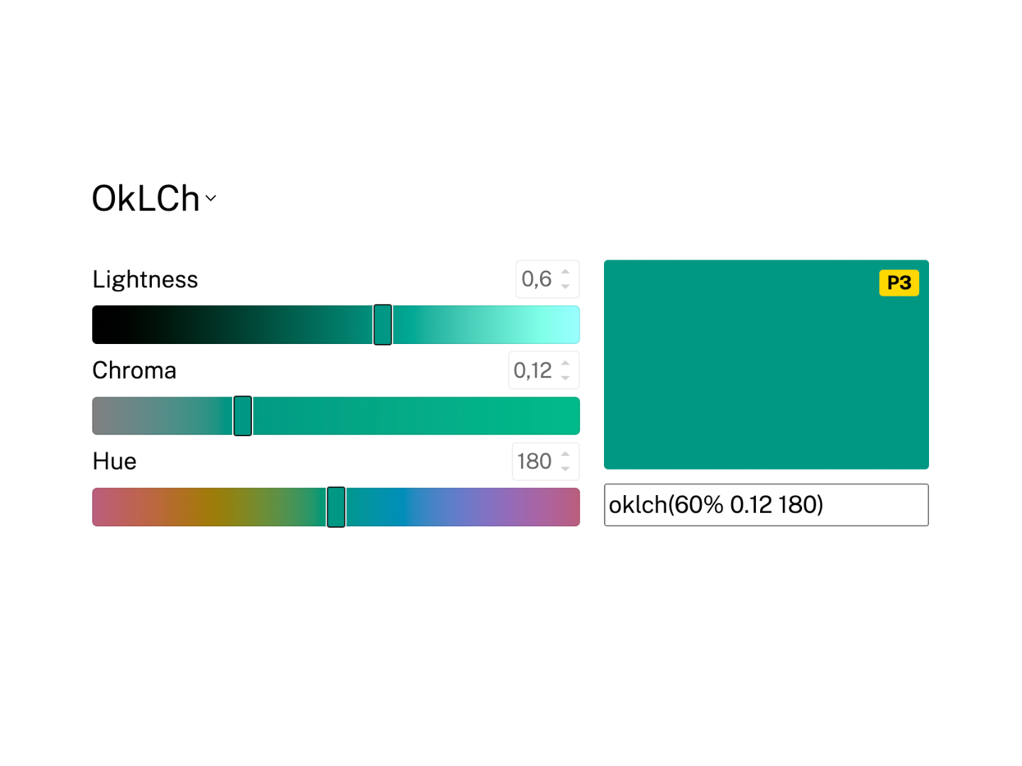
<color-picker>
Select and adjust colors in any color space using sliders and input fields.
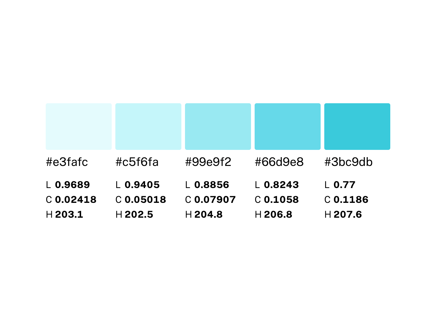
<color-scale>
Display a list of colors. Primarily intended for color palettes.
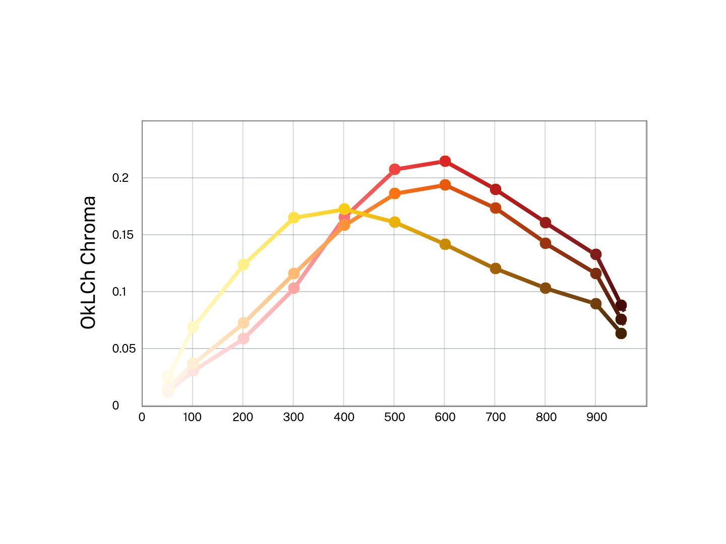
<color-chart>
Display lists of colors as a scatterplot or line chart.
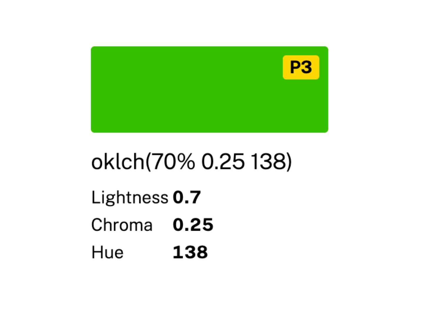
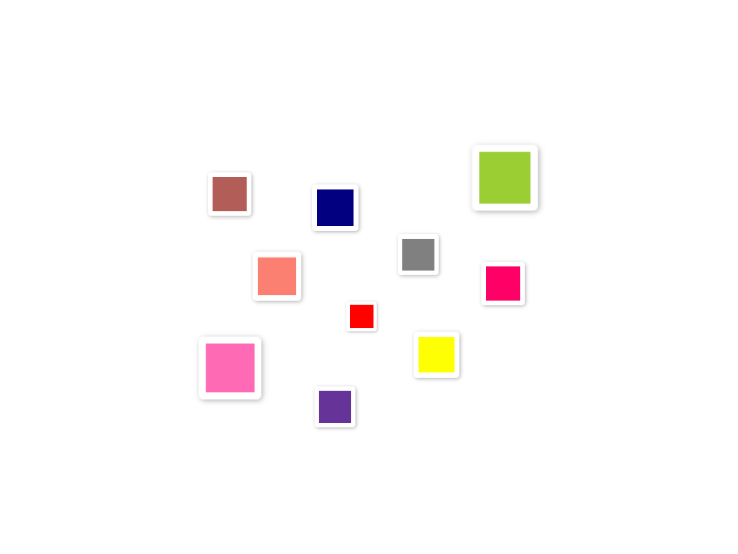
<color-swatch>
Display a visual representation of a color alongside the info about it.
<color-inline>
Display a color swatch alone or alongside its textual representation.
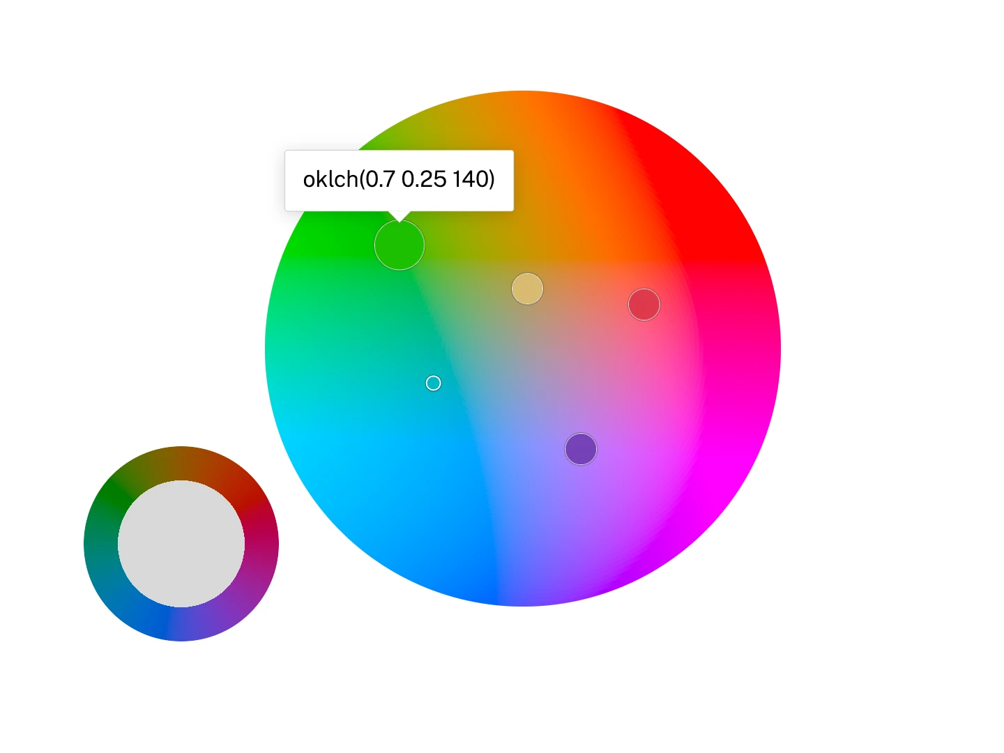
<hue-wheel>
Display a polar color wheel for picking hue and an optional radial channel in any polar color space.
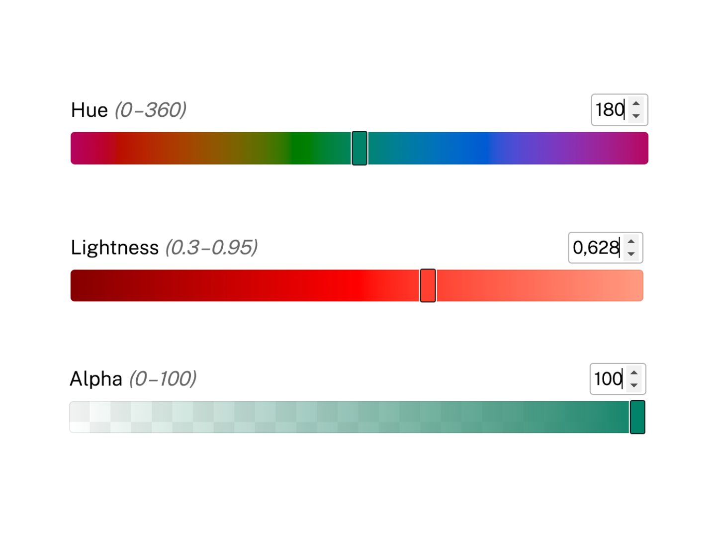
<channel-slider>
Display a <color-slider> for a specific channel.
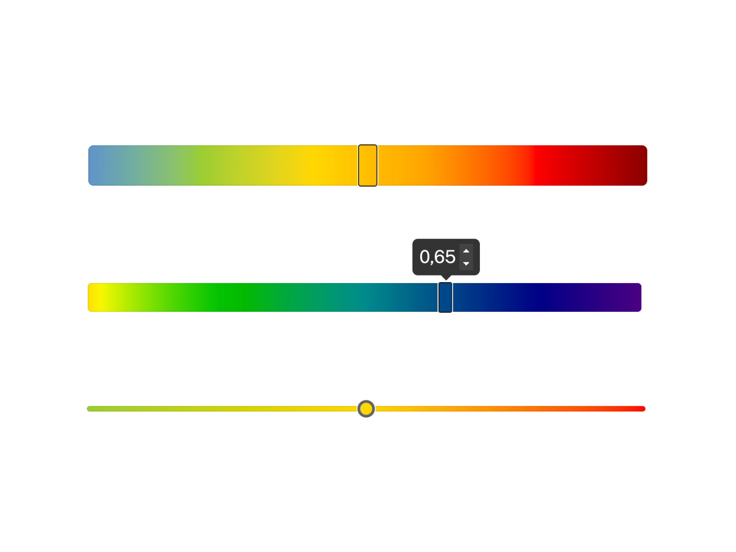
<color-slider>
Display a slider with a gradient background. Primarily intended for color picking.
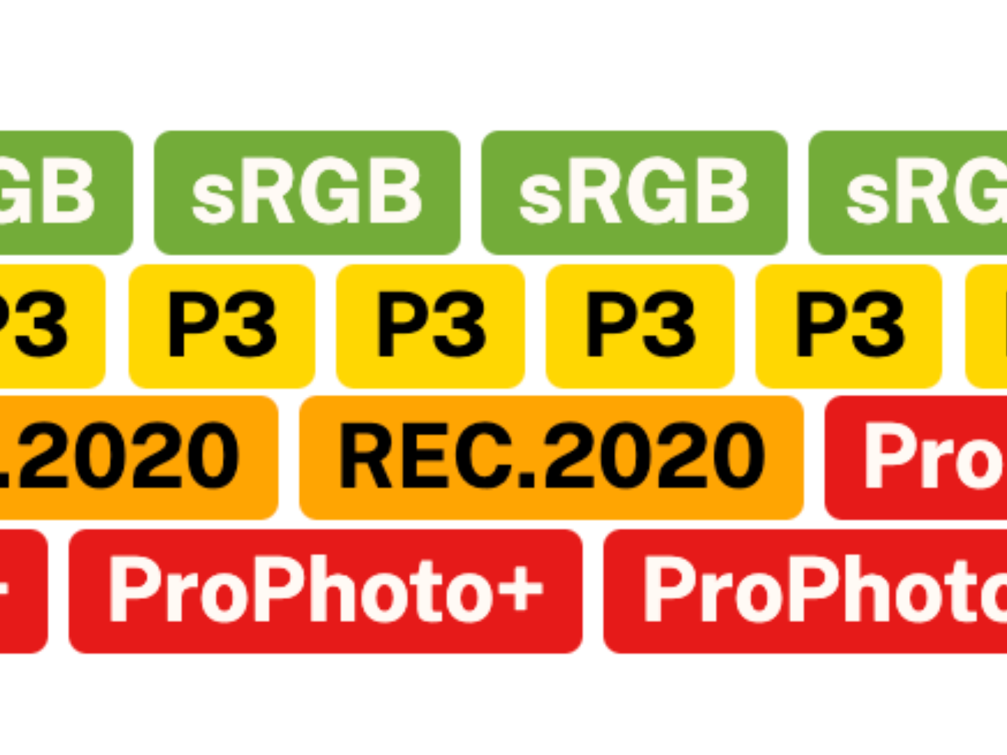
<gamut-badge>
Gamut indicator. Used internally by <color-swatch>.
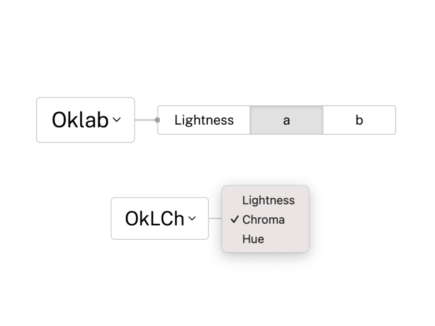
<channel-picker>
Select individual color channels within a specified color space.
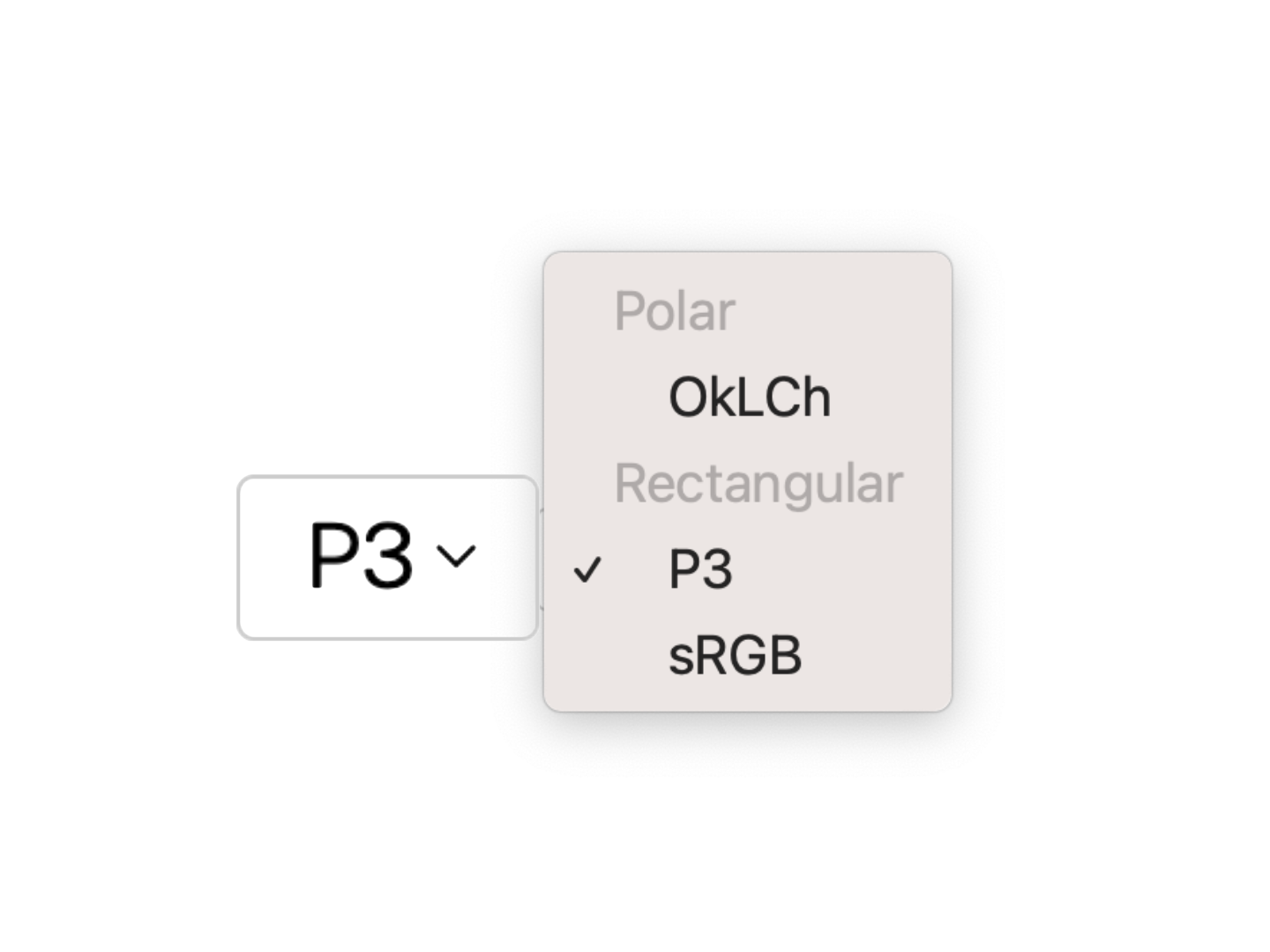
<space-picker>
Select a color space from a list of predefined or custom color spaces.
Upcoming
<color-plane>
Usage
Via bare specifiers
Install via npm:
npm i color-elements
To include all components at once:
import "color-elements";
You can also import individual components:
import "color-elements/COMPONENT_NAME";
Each component also exports a standalone CSS file (for CSS-only usage):
@import url("color-elements/COMPONENT_NAME.css");
You can use these imports with Nudeps — no bundler needed (this website does) — or with any bundler you already have.
Via CDN
If you’d rather not set up any tooling, you can use a CDN such as esm.sh:
<script src="https://esm.sh/color-elements" type="module"></script>
To cherry-pick individual components:
<script src="https://esm.sh/color-elements/COMPONENT_NAME" type="module"></script>
Each component imports its own dependencies and styles.